In the pantheon of rock and roll, few bands loom larger than the mighty Led Zeppelin. Their blaring riffs, thunderous drums, and Plant’s howling vocals created a sound that shook the Earth to its very core, but the band’s artistic genius wasn’t confined to the auditory sphere.
Hell, no. The album covers were every bit as boundary-pushing, mind-bending, and soul-stirring as the aural delights etched into the vinyl they encased.
We’ve all got our favorites – that Hindenburg in flames, the mystic man of the mountains, the monolithic obelisk known only as the object. Led Zeppelin’s album covers are the kind of works that slap your mind awake and demand to be deciphered.
Each one is a piece of the puzzle, an integral chapter in the arcane lore of Zeppelin.
So, get ready for a deep dive into these visual masterpieces, these monuments of rock iconography. Sit tight, keep your arms and legs inside the ride at all times, and remember to breathe.
The Art Of Led Zeppelin’s Album Covers
‘Led Zeppelin’ (1969)

A photo of the Hindenburg airship, silhouetted against a sky ablaze, adorns the cover of the eponymous debut album of Led Zeppelin. Designed by George Hardie, it’s a picture that doesn’t just speak a thousand words, but screams them, like the furious, rising phoenix of a new era in rock music.
The cover is a pure reflection of the revolution within – a defiant statement of intent. It’s the aural equivalent of that burning airship – catastrophic, full of turbulent energy that is threatening to explode, just like the sonic eruption when you drop the needle on that first track, “Good Times Bad Times”.
Hardie chose the image of the Hindenburg, the German airship engulfed in flames, plummeting to earth on its maiden voyage to America in 1937, as a potent symbol of the disruptive, earth-shattering impact Led Zeppelin was set to make on the world. And oh, what a prophecy it turned out to be.
The album’s cover, stark and monochromatic, mirrored the music within; bluesy, raw, and unadulterated. This was rock and roll, stripped down to its core, then amplified to oblivion. The cover, like the music, was a shot across the bow of the music industry, a loud proclamation that rock and roll was back with a vengeance, and its name was Led Zeppelin.
Who could have known that this simple black and white cover, with a burning airship, would become one of the most recognized and iconic album covers in rock history? The Hindenburg disaster was a tragedy, no doubt, but from the flames of that disaster, Led Zeppelin emerged, forever burning bright in the history of rock music.
‘Led Zeppelin II’ (1969)
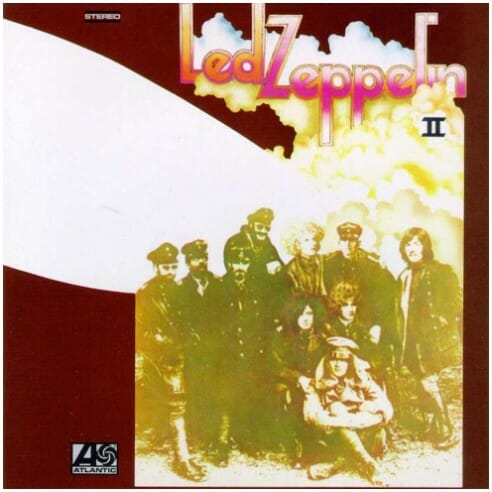
For a follow-up to their explosion of a debut, Led Zeppelin wasn’t pulling any punches. Released in the same year as their first, the cover of ‘Led Zeppelin II’ was a departure from the stark realism of the first, instead opting for a surreal and chaotic pastiche.
Designed by David Juniper, who was reportedly inspired by a photograph of a Division of the German Air Force during World War I, the cover features the band’s faces superimposed over the original image, amidst a swirl of psychedelic clouds and a sky stained blood-red. There’s Robert Plant, looking like a long-haired Adonis in a mystical dogfight, and Jimmy Page, the guitar wizard conjuring riffs that could cut through steel.
It was a cover that promised a wild ride, a cover as loose, bold and hallucinogenic as the tunes imprinted in the grooves. With its groundbreaking incorporation of blues influences into the genre of hard rock, ‘Led Zeppelin II’ was a sonic leap forward, and the artwork reflected this progress in its unabashed weirdness and creativity.
RELATED: The Amazing Album Art Of Queen
‘Led Zeppelin III’ (1970)

After the brazen audacity of ‘II’, Zeppelin again zigged where others zagged. For ‘III’, the band opted for an interactive album cover designed by Zacron, a multimedia artist who had studied with Page at Kingston College of Art. It was a tactile joy, a wheel of images that could be rotated to reveal different images and lyrics through cutouts on the front sleeve.
The cover was a maddening hodgepodge of images, an explosion of pop art ethos reflecting the eclectic nature of the music within. You’ve got photos of the band members, images of nature, abstract art and a surreal collection of seemingly random objects. It was strange and mystifying, and it absolutely did its job – it sparked a fascination, a wonder, and isn’t that what Zeppelin’s music was all about?
This was a cover that invited exploration, much like the music within. The album is perhaps their most experimental, delving into acoustic and folk styles while still retaining their hard rock roots. And as with their music, Zeppelin was never one to take the beaten path when it came to their album covers.
‘Untitled (Led Zeppelin IV)’ (1971)


But where do you go after a spinning wheel of surreal imagery? Well, if you’re Led Zeppelin, you opt for mystery and minimalism, that’s where. ‘IV’ – the album so legendary it didn’t even need a name. Instead, it was symbolized by four cryptic symbols chosen by the band members, representing each one of them in some mystical, arcane fashion.
The cover, however, was a dichotomy – the front featured a rustic, 19th-century oil painting of an elderly man, hunched under a bundle of sticks. But on the reverse, there’s a bleak, grey, and anonymous tower block, a drab scene from everyday life. A tale of two worlds, the urban and the rural, the modern and the ancient, the profane and the sacred – much like the album itself, bridging the gap between earthy folk and sky-scorching rock.
This was Led Zeppelin at their most enigmatic, refusing to play by the rules, and insisting on carving their own path. They didn’t need to shout about who they were anymore – they simply let the music do the talking, hiding behind the eerie symbolism and stark imagery of the artwork. A stark contrast to the groundbreaking and seismic ‘Stairway to Heaven’ hidden within the album, waiting to be discovered. An album so legendary it didn’t even need a name, it was ‘IV’ and that was enough. And in retrospect, wasn’t it just perfect?
‘Houses of the Holy’ (1973)
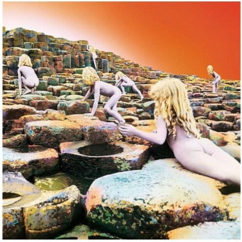
Led Zeppelin again turned a corner with ‘Houses of the Holy’, where the band started to explore new territories, introducing elements of funk and reggae into their thunderous rock sound. The album cover is an equally arresting departure.
A surreal, otherworldly tableau created by Aubrey Powell and Storm Thorgerson of the famed design firm Hipgnosis, the cover art features nude children ascending the Giant’s Causeway in Northern Ireland.
The image, inspired by Arthur C. Clarke’s ‘Childhood’s End’, provokes a sense of alien beauty and innocence, a nod to the mythical and the fantastical that often underpinned the band’s music. The unnaturally tinted sky, the stark landscape, the mystifying scene – it’s an album cover that doesn’t just catch the eye, but holds it, refusing to let go. As the band’s sound matured and expanded, so too did their approach to cover art.
RELATED: We Rank Led Zeppelin’s Best Albums
‘Physical Graffiti’ (1975)
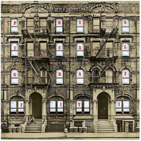
‘Physical Graffiti’, a sprawling double album that crosses genre boundaries, could only be housed in a cover as complex and ambitious as the music itself. The cover is a photo of two New York City tenement buildings, filled with windows that hold surreal scenes when the insert is pulled out and rearranged.
The cover, designed by Peter Corriston, with windows photographed by Elliott Erwitt, Burt Glinn, and Greg Copeland, encapsulates the urban grit and glamour in a perfect fusion, the myriad windows reflecting the wide variety of songs within. It’s a city block that holds the world, a slice of the cosmos in the form of a New York City street – an artistic statement of the band’s mastery and diversity.
‘Presence’ (1976)
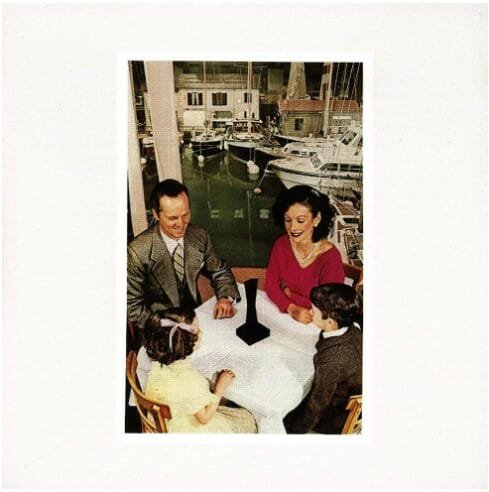
With ‘Presence’, Led Zeppelin presented an image that’s as bewildering and intense as the music it envelopes. The Hipgnosis-designed cover presents a mysterious object (known as “The Object” or “The Obelisk”), a dark, otherworldly figure that a picture-perfect family seems to worship in an otherwise mundane setting. It’s a bizarre juxtaposition, a piece of science fiction interrupting suburban reality.
The unsettling imagery mirrors the album’s content, marked by a frenzied urgency due to Robert Plant’s recent car accident and the resulting time pressure to complete the album. The black obelisk – a symbol of raw, monolithic power – reflects the hard, driving force of the album’s music. ‘Presence’ stands as proof that Led Zeppelin’s taste for the intriguing and uncanny remained unabated in their later years.
‘The Song Remains the Same’ (1976)

‘The Song Remains the Same’ is the soundtrack album of their concert film of the same name, and it’s as much a grandiose spectacle as the movie it scores. The cover, designed by Hipgnosis and Hardie, is an ethereal piece of work, presenting each member of Led Zeppelin in a separate fantasy sequence, reflecting the dreamy, larger-than-life aspect of the band.
Each band member’s vignette is an echo of their on-screen fantasy sequence from the film, reinforcing the mythic, self-constructed identities of the band members. Jimmy Page is depicted as a wizard, Robert Plant as a Viking, John Paul Jones as a masked horseman, and John Bonham as a family man. The cover doesn’t just promote the film; it embellishes the mythology of Led Zeppelin.
RELATED: The Stories Behind Motley Crue’s Best Album Covers
X. ‘In Through the Out Door’ (1979)
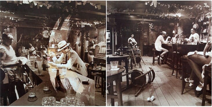
As the band’s final studio album, ‘In Through the Out Door’ stands as the last testament of Led Zeppelin’s epic journey. The cover, again from Hipgnosis, comprises of six alternative scenes depicting a man in a sombrero burning a letter in a bar, all shot from the differing perspectives of the people in the bar. The sepia tone gives it a timeless feel, a reminder of the band’s lasting influence and enduring legacy.
Each version of the cover tells a slightly different story, a fitting metaphor for an album recorded by a band in flux. The viewer can decide which narrative they wish to follow, much as listeners could choose their own journey through the band’s music. It’s a poignant end to the band’s studio discography, a final exploration of the narrative potential of album art.
After having fun with the variations of the cover, Hipgnosis chose a different path with the outer sleeve resembling a plain paper bag. This was in response to the group’s manager exclaiming “I could sell Led Zeppelin in a fucking brown paper bag!” when told about the huge cost of the project.

XI. ‘Coda’ (1982)

The posthumous ‘Coda’, a collection of outtakes and leftovers, features a minimalist cover compared to its predecessors. The white background hosts an old photograph of an elegant party, with the album’s title and band’s name scrawled above in rough, almost child-like handwriting. It was designed by Hipgnosis, and the photograph was taken during the early 20th century in an unknown location.
This final entry in the Led Zeppelin discography is marked by a sense of looking back, as if sifting through old memories. The elegance of the party contrasts with the rudimentary scrawl of the words ‘Led Zeppelin Coda’, as though the grandeur of the past is being reconsidered and recontextualized. It’s a farewell, a final note on the band’s remarkable journey through music and visual art.
Final Thoughts On The Visual Poetry Of Led Zeppelin
The voyage through Led Zeppelin’s album cover artistry has been akin to a journey through the very heart of rock and roll. The band’s visual expression evolved alongside their sound, from the bold and controversial beginnings with ‘Led Zeppelin’ to the poignant nostalgia of ‘Coda’.
The role of Hipgnosis in shaping the band’s visual identity cannot be overstated. Their daring, innovative work stretched the boundaries of what album art could be, fusing photography, design, and surrealism into something that genuinely expanded the experience of the music within. It is not only a testament to the band’s commitment to their art but also a snapshot of a time when album covers were as instrumental to a band’s persona as the songs themselves.
Throughout the years, Led Zeppelin’s album covers have become iconic, the stuff of rock legend, as layered and profound as the music itself. They serve as relics of an era where music and visual art intertwined, creating a holistic sensory experience.
In the end, Led Zeppelin’s album covers remind us that music is more than just sound. It’s a fusion of creativity, expression, and storytelling that engages all senses. Just like their music, Led Zeppelin’s album cover art remains timeless and transcendent, a testament to their enduring influence.
As the song remains the same, so does the art – bold, enigmatic, and evocative. The covers of Led Zeppelin’s discography are not merely pictures but windows into a time and place where music was the universal language, and every album was a new universe waiting to be discovered.
If you want to know more about Hipgnosis, the legendary design firm responsible for half of your record collection, check out the video below that dives into their story.
- The 25 Richest Rock Stars in the World | A Rock And Roll Rich List - February 22, 2024
- Rock And Roll Movies | 20 Films That Will Rock Your World - February 19, 2024
- The Biggest One Hit Wonders In Rock History - February 16, 2024


